Cool Cats
Background
Cool Cats is a global character brand built around its beloved lead character “Blue Cat”, created by artist Colin Egan in 2013. Today, Cool Cats boasts a rich universe filled with captivating characters, comics, games, merchandise, and animations that are designed to deliver inclusive, impactful, and community-driven stories.
My Role
I was the UI/UX and visual designer owning all aspects of the website and other relevant web experiences.
My responsibilities include creative ownership of the website, conducting a web audit, ideating concepts, wireframing, iterating on feedback, creating a design system, and collaborating with a developer to ensure correct execution.

Objective
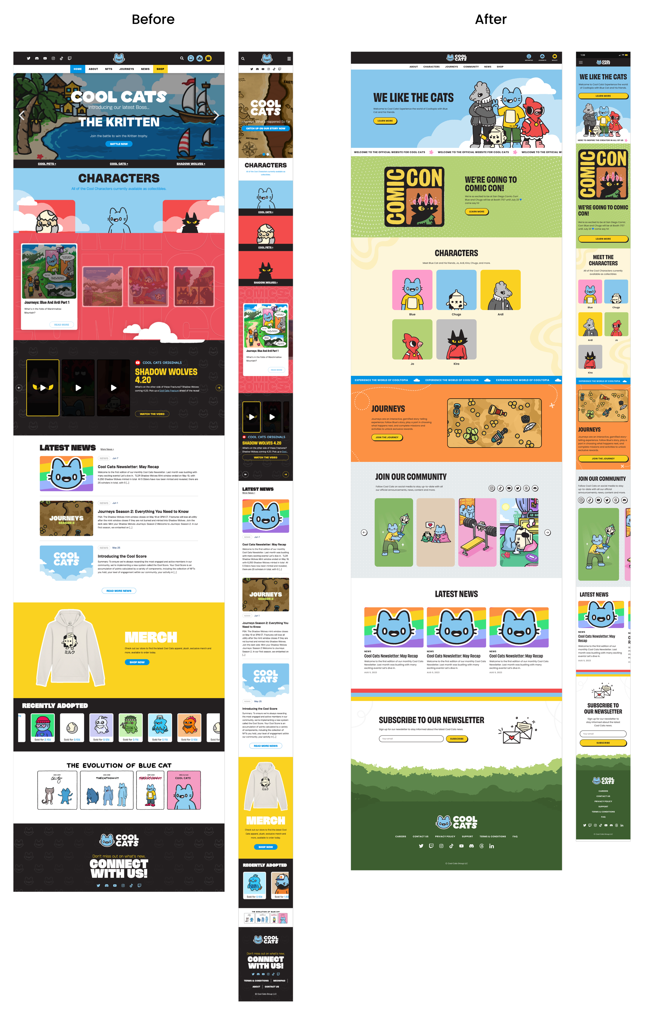
Design a fresh website that improves user engagement and lets users easily navigate between pages to learn about the brand, its characters, view comics, and more.

Information Architecture
I restructured the website's information architecture to ensure users can easily navigate the website and all pages were logically categorized. There were additional pages that weren’t in the old website that we included such as the founder’s story page and character pages.

Establishing a Cohesive Design System
I had the pleasure and opportunity to build a design system from scratch to ensure visual consistency across web experiences. Part of this contribution consisted of updating brand elements including typography, adding new colors, and creating a visually appealing layout to really make the brand come to life.
The design system encompassed:
Color Palette: I added new colors to the color scheme, aligning with Cool Cats’ brand personality, while also ensuring accessibility.
Typography: A custom font was chosen for its legibility and consistency across various devices.
Icons and UI Elements: Custom icons and UI components were designed to provide a unique and user-friendly experience.
Typography
Headlines are to be used by Obviously Narrow, a bold and impactful san-serif font. Its tall and squished display type makes it great for longer headlines. Body copy and smaller subheadings remain in Poppins, a clean and versatile sans serif that’s consistent and legible across devices.
Illustrations
Playful colorful illustrations to showcase the approachable nature of the brand. The illustrations feel warm and relatable.

Final Design
After creating the UI and visual elements, the designs were then handed off to a developer to build the new site.


Conclusion
Overall, this was a fulfilling project that utilized all of my skillsets in visual design, illustration, and UI/UX. My biggest learning experience was understanding how to collaborate effectively with an engineer. This involved not only determining what was feasible from a development perspective, but also establishing a workflow that facilitated seamless cooperation between us.